Returning to the dance studio safely (covid-19)

I'm a Pro/Am and Am/Am, and I'm totally comfortable in lessons demonstrating figures and choreography on my own, and I'm totally comfortable practicing on my own. So, if competition organizers are willing to open up those “Solo Star” events to Adults, I would enter them.

A few years ago, my Pros and my Amateur partner couldn't attend a particular comp, and a USA Dance organizer let me enter the Solo competitor events. I found it worthwhile.
 
I would hope that studios will require masks for students while the risks persist
To me, the definitions of the words “risks” and “persist” are very broad, and will mean different things to different people. I’m ready to resume in-person private lessons at the studio - either the current one or new one or both - as soon as they open their doors.

I don’t have any hope that a Covid-19 vaccine will be any more effective than the vaccines we get each year for the regular flu strains that come around. Therefore, I’m not going put my life on hold waiting for one to be developed, although I’ll still get the vaccine each year to speed up the process of herd immunity.

But I agree...social dances are probably going to be nonexistent for a while.
 
I don’t have any hope that a Covid-19 vaccine will be any more effective than the vaccines we get each year for the regular flu strains that come around. Therefore, I’m not going put my life on hold waiting for one to be developed, although I’ll still get the vaccine each year to speed up the process of herd immunity.
It will probably be next year before a vaccine is widely available, even if an effective vaccine is developed. Expecting everyone to lose a year of their lives may not be that reasonable an option.
But I agree...social dances are probably going to be nonexistent for a while.
I'm not sure if this is still a response to me, but I can imagine social dances resuming for those who feel they are important enough, with mask use and lots of hand sanitizer between dances and partner switches. I can imagine a fair percentage of people electing not to go.

I think dances that are basically competitor practices, with people dancing just with their own regular partners, would be fine.
 
I don’t have any hope that a Covid-19 vaccine will be any more effective than the vaccines we get each year for the regular flu strains that come around.
I think there's hope there. The flu vaccines are so ineffectual partly because they have to guess what flu strains will be circulating. A COVID19 vaccine would only have to target one strain
 
I would not place any faith in hand sanitizer and masks making social dancing safe. Those measures can be effective when combined with "social distancing", but "social distancing" and social dancing are incompatible concepts. The cloth masks that people use will be pretty worthless in dance frame. A more effective mask will restrict airflow and make the elevated breathing required to dance difficult.
 
Snapdancer,
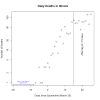
I wouldn't put faith in a mask if the number of infective people is large or medium and growing. But honest, I think we are going to have this beat. I'm not going to fully explain why I think we know how to beat it, but based on Illinois quaratine (and having coded up run a shitwad of SEIR models to get a "feel" for how things pan on based on the effective reproductive rate for the virus and a few other things), I think Illnois's quaratine has knocked "Ro" from ~3 "no quarantine" to "after quarantine" to ~0.5 after. (This is all eyeball based on the flattening of daily deaths about 15 days after the onset of quarantine. The 15 days is "significant" because there's some reason to believe that is about the mean time after onset of symptoms when people who do die, die. See figure below.)
DailyDeathsApril19.png

Of course, this is tentative.... and out there. My hope this is over could be overwhelming everything-- and there's not much math here. Still, I have a prediction for Illinois. My prediction: The number of infected in Illinois have already dropped a lot. (I'd have to put my SEIR models up... and gin up a few things to explain why. But really, that would just make it look less speculative because it's saying there is "math" behind this. But... really, it's all qualitative.)

Anyway: my prediction steady drop in daily deaths should be visible by eyeball in two weeks or so. By then, slowly letting people circulate (while keeping R <1) will keep the numbers of infected low. Some people will still get sick, but that happens with all diseases (e.g. measles). I'd hope people still do things like wear masks where practical. But we could allow some "not entirely safe" activities and still be fairly safe. Each individual could decide their own level of risk-- but if R<1, it won't get tooo high.

We still will want a vaccine. Antibody tests would still be very useful. But honestly... I my prediction is: in about 2 weeks (after the data come in and do what I predict! :) ) we'll be able to talk about loosing the quarantine. (Preferably in sane ways!)
 
I've been looking at a different set of data, the cumulative cases on this website. https://coronavirus.jhu.edu/us-map

Looking at the graphs for Illinois and Cook county, the trendline is increasing and linear. Counties in my area show similar trends. I expect that most cases are identified on admission to the hospital, because despite statements from a certain person in DC testing has not improved. The delay from infection to hospitalization is around 2 weeks, given that we're over 3 weeks into lockdown this tells me that R0 is being held at about 1, since there's no indication of a flattening within the last week or so. If it's 1 while we're in lockdown, then we can expect it to go above 1 after exiting lockdown, the epidemic will spread, the healthcare system will be overwhelmed, and we'll be right back into lockdown.

In short, I don't share your optimism that we have this thing beat.
 
Looking at the graphs for Illinois and Cook county, the trendline is increasing and linear.
Are you looking at cases or deaths? It's hard to know from the link because that site has it set up to send someone to the "front page", where they can each them make choices. But I can't tell what choices you made from your link; I need words. That's a pesky thing about those sites.

Most of those sites show cummulative deaths. Mine is daily deaths.

Cummulative deaths can't be constant until daily deaths are zero. If daily deaths are constant, cumulative goes linear. I can make the cumulative death graph too. But I like daily deaths as a function of time for eyeballing if quarantine "worked"

I like deaths to try to make a guestimate because -- not to be too bloodless-- dead is dead. Case counts are affected by diagnosis, availability of tests (which are increasing though not fast enough ) and so on.

infection to hospitalization is around 2 weeks, given that we're over 3 weeks into lockdown this tells me that R0 is being held at about 1,
Yes. That's my "15 days" for a lag to die. (Wuhan had an estimate of 18 days.. but a statistician blogger whose written this https://bskiesresearch.files.wordpress.com/2020/04/operational.pdf estimates 15. I used James number.

If R0 was 1 down from 3, the daily deaths would still be increasing.
 
Last edited by a moderator:
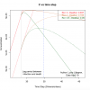
The solid lines below are output for "I" from an SEIR model I ginned up. I'm an engineer so it's non-dimensional. :) (To get a feel for time from "time step" multiply by 2 days which corresponds to the "lag" in an SEIR model.) I call everything "concentration" because it's a fraction of the total population.

The solid is the trace shows how the fraction of the population that is currently infectious grows with time if Ro=0. Then at at a particular time (picked arbitrarily) I stuck in a "quarantine" which affects R0. So, in the sort of brown case, I made R0=1, in the green case I made R0=0.5. Looking at the solid lines, the model predicts that the number of infectives continues to rise for a while, then, flattens (as expected) for R=1, it drops for R0=0.5.

BUT infectives aren't deaths. that's not deaths. So, I did a kludgy thing and just added a "deaths" to the SEIR. It's to get a qualitiative view of what the deaths will look like. Since SEIR aleady looks like a model for a stirred reactor, I then put in another box of deaths. I lagged that by the 15 days (and divided by 2... to make dimensionless.) These "daily deaths" (scaled to fit on graph) are shown on the graph.

(BTW: the actual numbers are pretty arbitrary because I just started the quarantine at an arbitrary time and my model for deaths.... well... my model eventually kills everyone who gets sick. We would just multiply that by the actual mortaility rate to get a more reasonable number, but then it wouldn't fit on the graph. So... qualitatively, this shows how things "would look".)

Anyway: Using this (not very wonderful model-- but not so horrible for purposes of visualizing
  • With no quaratine, deaths would have continue to look linear on the semi-log graphs. (Red dotted.)
  • If Ro=1 after quarantine, daily deaths would be rising during the lag period between quarantine and deaths. The bend happens later. See the brownish line.
  • If Ro=0.5, we'd start to see flattening during the lag period.
So: I think the quarantine has Ro<1. Because the shape we are seeing is more like the green than the brown.
 

Attachments

  • DeathsQualitative.png
    DeathsQualitative.png
    72.1 KB · Views: 3
Snapdancer,
I wouldn't put faith in a mask if the number of infective people is large or medium and growing. But honest, I think we are going to have this beat. I'm not going to fully explain why I think we know how to beat it, but based on Illinois quaratine (and having coded up run a shitwad of SEIR models to get a "feel" for how things pan on based on the effective reproductive rate for the virus and a few other things), I think Illnois's quaratine has knocked "Ro" from ~3 "no quarantine" to "after quarantine" to ~0.5 after. (This is all eyeball based on the flattening of daily deaths about 15 days after the onset of quarantine. The 15 days is "significant" because there's some reason to believe that is about the mean time after onset of symptoms when people who do die, die. See figure below.)
View attachment 4195
When I look at case counts for Illinois, what I see is that exponential growth ends about April 4, with detected new cases being constant thereafter. This is consistent with about a 15 day lag from several closely spaced mitigations - restaurant closures on March 15, school closures on March 17, and whatever additional mitigations you had on March 20.

However, I don't see how you get an "after" R of 0.5? Constant new cases and constant new deaths should mean steady state, which would correspond to an R of 1.0, which is what I think Illinois is at right now. For reopenings of businesses and ballrooms without a return to exponential growth, you'd need some compensating additional mitigation. For example, you could require masks, which reduces R, and reopen businesses, including dance studios, which would increase R, but hopefully by less.

Massachusetts closed our schools 5 days before we closed our businesses, and you can see in the case graph the both of those separate events. School closure reduced R by 50%, and :"nonessential" business closures by an additional 15%, but R appears still to have been above 1.0. Something then happened at the very end of March which dropped R by another 15%, but it must have been temporary because cases then grew at a greater than exponential rate. The only thing I can identify in the right time frame was additional restrictions on how grocery stores were run; I suppose compliance might have dropped with time after that.

In the most recent 3 days, new case and death counts in Massachusetts have been roughly constant, but I don't think 3 days is enough to say we have it beat yet. We really need to push mask usage if we are to reopen dance studios and other businesses. And unfortunately, governments in Massachusetts seem highly resistant to requiring masks.
 
Last edited:
BUT infectives aren't deaths. that's not deaths. So, I did a kludgy thing and just added a "deaths" to the SEIR. It's to get a qualitiative view of what the deaths will look like. Since SEIR aleady looks like a model for a stirred reactor, I then put in another box of deaths. I lagged that by the 15 days (and divided by 2... to make dimensionless.) These "daily deaths" (scaled to fit on graph) are shown on the graph.
Are you saying you used two cohorts of deaths, one lagged and one not? Or just one cohort of deaths which is lagged?

If the latter, you also added some variability in the lag to death, or the curve would look like the infection curve. The shape of your death curve is highly dependent on your assumed variability.

I think the gradual change in slope in the actual data is not because of variability in time to death, but rather because the mitigations were put in place gradually, between March 15 and March 20.
 
Welll... I added a bin to SEIR. So, SEIRD.
In SEIR, "Recovered" really means "no longer infective". So, I computed that the normal way. (I don't show this on my plot.)

Then I added a big for Dead. To compute the differential who died I use

ΔDead/Δt = τd Crecovered. (1)

I actual time scale I used corresponds to:

τd = τd_reported - τlag.
(But then I make everything dimensionsless with τlag.
In terms of equivalencies, I used τd_reported=15 days and τlag = 2.
And... fwiw, my model organization all the R's die. (This could be adjusted using a scale factor. The part that could easily be criticized is using something like (1) at all. )

Basically acts like a stirred reactor with yet another process. But I think it does give a qualitative picture to show the "shape" of death rates, and perhaps not to crummy in the short term.

(James Annan has a better model for killing people off. He usees a gamma distributio for death rates and uses the historic infection rates to get current death rates. I didn't what to plow through and code that. But I think it doesn't affect the qualitative behavior too much.)
 
The solid lines below are output for "I" from an SEIR model I ginned up. I'm an engineer so it's non-dimensional. :) (To get a feel for time from "time step" multiply by 2 days which corresponds to the "lag" in an SEIR model.) I call everything "concentration" because it's a fraction of the total population.

The solid is the trace shows how the fraction of the population that is currently infectious grows with time if Ro=0. Then at at a particular time (picked arbitrarily) I stuck in a "quarantine" which affects R0. So, in the sort of brown case, I made R0=1, in the green case I made R0=0.5. Looking at the solid lines, the model predicts that the number of infectives continues to rise for a while, then, flattens (as expected) for R=1, it drops for R0=0.5.

BUT infectives aren't deaths. that's not deaths. So, I did a kludgy thing and just added a "deaths" to the SEIR. It's to get a qualitiative view of what the deaths will look like. Since SEIR aleady looks like a model for a stirred reactor, I then put in another box of deaths. I lagged that by the 15 days (and divided by 2... to make dimensionless.) These "daily deaths" (scaled to fit on graph) are shown on the graph.

(BTW: the actual numbers are pretty arbitrary because I just started the quarantine at an arbitrary time and my model for deaths.... well... my model eventually kills everyone who gets sick. We would just multiply that by the actual mortaility rate to get a more reasonable number, but then it wouldn't fit on the graph. So... qualitatively, this shows how things "would look".)

Anyway: Using this (not very wonderful model-- but not so horrible for purposes of visualizing
  • With no quaratine, deaths would have continue to look linear on the semi-log graphs. (Red dotted.)
  • If Ro=1 after quarantine, daily deaths would be rising during the lag period between quarantine and deaths. The bend happens later. See the brownish line.
  • If Ro=0.5, we'd start to see flattening during the lag period.
So: I think the quarantine has Ro<1. Because the shape we are seeing is more like the green than the brown.

That's really fascinating!

On the topic of modelling, have you seen that the Imperial College model is up on GitHub?

I only just glanced at it enough to realize that it was in R, myself.
 
When I look at case counts for Illinois, what I see is that exponential growth ends about April 4, with detected new cases being constant thereafter. This is consistent with about a 15 day lag from several closely spaced mitigations - restaurant closures on March 15, school closures on March 17, and whatever additional mitigations you had on March 20.
Yes. My grey line is March 20. It could, perhaps be more accurate to have a "fuzzy band".

However, I don't see how you get an "after" R of 0.5? Constant new cases and constant new deaths should mean steady state, which would correspond to an R of 1.0, which is what I think Illinois is at right now.
I don't look at case counts. I think that data is to strongly affected by changes in the number of test kits, limitations of of access. In contrast, dead is dead.

Constant death rates forever means steady state. Constant death rates instantaneously can mean a min/max. Just like position vs. time for a ball thrown up and down. dy/dt = 0 at the top. It doesn't mean the ball stays there. Given the process and the noise in the data, "flattish" for a while can mean a "top".

For reopenings of businesses and ballrooms without a return to exponential growth, you'd need some compensating additional mitigation. For example, you could require masks, which reduces R, and reopen businesses, including dance studios, which would increase R, but hopefully by less.
For full reopening. Partial... maybe not so much. Shut down doesn't have to be all of nothing. Yep. We would want to keep "R0<1".


In the most recent 3 days, new case and death counts in Massachusetts have been roughly constant, but I don't think 3 days is enough to say we have it beat yet. We really need to push mask usage if we are to reopen dance studios and other businesses. And unfortunately, governments in Massachusetts seem highly resistant to requiring masks.
I didn't even want to look after only 3 days. Toooooo much noise. To much desire to see a change in the trend. I do think we'll want to push mask use when people interact. We'll want it in stores, on public transportation, and yes, in dance studios. But we may be able to start doing things a little.

I admit.... I am being optimistic. But I think that's what the Illinois data look like. (I would advise waiting a bit to see the daily death rate actually drop.)

Without a vaccine, we won't be able to go back to status quo ante. But we may not need to have the level of stay-at-home we currently have. We still need the vaccine.
 

Dance Ads

Advertise on Dance Forums Reach dancers, teachers, studios, event organizers, and dance-friendly brands. View ad options
Back
Top